Sunday, March 28, 2010

Original Watercolor Art


Original Watercolor Art
Watercolor is a delightful medium to use and it offers a great deal of potential for all kinds of subject matter. For me, appeal of watercolor lies in the way that it can be applied in subtle washes (a ‘wash’ is a thin layer of translucent watercolor paint) to capture the transient effects of light and mood.

I like to use watercolor in a more controlled, detailed way.
For this playful painting I had chosen greens, blues, that represents harmony, red - joy, luck, happiness, orange and burnt sienna to bring warmth to the painting.
I use hand made, archival and PH neutral watercolor paper by Arches or Winsor & Newton.

original watercolor art
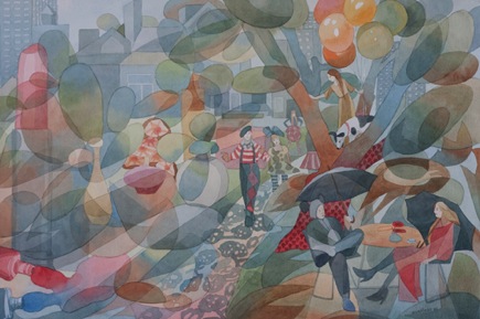
"In The City" Watercolor on watercolor paper. ©Ezartesa.

Wednesday, March 24, 2010

Painting with Watercolor

Painting with Watercolor.
midnight-symphony


Midnight Symphony 15" X 22" watercolor on watercolor paper. © Ezartesa.

Transparency is the most unique quality of watercolor, as it allows the white of the paper to shine through. In addition to transparency, in this painting, I focused on glazing. Glazing is the technique of painting a wet wash (or layer) of color over a previously dried layer of color, to give the optical illusion of a third color.
To add interest to the painting I brought patterns and abstract shapes using one shape over and over, and interlocking it with another.
I have chosen three sleeping birds: swans and Canada geese in order to express one and the same feeling, because I know that repetition of one and the same thing deepens the effect produced. I painted two other geese in action, to give a painting a filing of sound.
For the sky in my painting, I was inspired by magical image of night sky, studded with gold stars, decorating the ceiling of the ancient Egypt tomb.
Big moon symbolizes home. Colors in my painting shift from dark to light. Neutrals - cream, white, beige, brown and grey blue – brings a relaxed, calming feeling.

Monday, March 15, 2010

Understanding Color


Understanding Color
Colors work together in different ways.
There are basically two types of relationship between colors – harmony and contrast. Colors that are next to each other for example red and yellow, are harmonious, while those that are opposite, for example red and green, contrast with each other. Harmonious colors are more calming, and contrasting colors are more dramatic.
In this
handmade necklace I used different shades of green (forest green, light green, mint green) and added little bit drama with contrasting color root beer. For background I had chosen neutral color cream, added shine and texture with copper beads.

designer jewelry

In this modern, abstract painting I had chosen harmonious, calming colors: blue, blue green, green and added warmth and balance to painting with contrasting color yellow ochre.

modern abstract